Image-Heavy Websites That Actually Load Fast: A Construction Industry Guide
Luxury construction demands high-fidelity architectural photography. But large images destroy load times. Here's how to achieve gallery-quality presentation with sub-2-second performance — the exact approach we used for a $250M+ construction firm.
The Fundamental Tension
Luxury construction websites face a specific technical problem: the images that sell your work also destroy your load times.
Architectural photography shot by professional photographers is large. A single project gallery might have 8-10 high-resolution images, each 3-5MB uncompressed. A mobile user on a 4G connection would wait 30+ seconds for a single project page to load.
Most users don’t wait. A 2018 Google study on mobile performance found that as page load time increases from 1 to 3 seconds, bounce rate increases by 32%. More recent data from WeArePresta (2026) shows that page load times increasing from 2 seconds to 4 seconds can reduce conversion rates by up to 25%. For a construction firm where every visitor is a potential project lead, that’s expensive.
The performance reality:
| Page Load Time | Bounce Rate Impact | User Perception |
|---|---|---|
| 0-1 seconds | Low | Fast, responsive |
| 1-3 seconds | +32% bounce (Google, 2018 mobile study) | Acceptable but noticeable |
| 3-5 seconds | Significantly elevated | Slow, frustrating |
| 5+ seconds | High abandonment | Broken, abandoned |
Bounce Rate vs Page Load Time (illustrative)
The challenge isn’t avoiding large images — it’s serving them intelligently.
Real-World Performance: 198ms TTFB
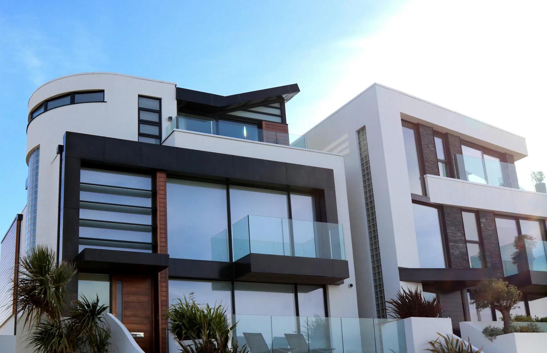
When we built the Alliance Living website, the brief included a non-negotiable requirement: showcase $250M+ in luxury construction with high-fidelity galleries, but load fast on mobile.
Alliance Living delivers projects in Point Piper, Vaucluse, Double Bay — addresses where architectural photography matters as much as the construction itself. Each project page has 8+ professional images. The site couldn’t sacrifice image quality for performance.
The delivered result: 198ms time-to-first-byte, measured via WebPageTest from Sydney across multiple consecutive requests on a warm Cloudflare CDN edge.
Even on project pages with 8+ high-resolution photographs, the gallery loads without perceptible delay. Mobile users see the first image immediately; below-fold images load progressively as the user scrolls.
Here’s the technical approach that made that possible.
Format Selection: AVIF Over WebP Over JPEG
The single biggest performance lever is image format. Each generation of format compression delivers 25-50% size reduction at equivalent visual quality.
| Format | Size vs JPEG | Browser Support | When To Use |
|---|---|---|---|
| JPEG | Baseline (100%) | Universal | Legacy fallback only |
| WebP | 25-35% smaller | 95%+ | Primary format for most projects |
| AVIF | 30-50% smaller than JPEG | ~93-95% | Default for new projects |
The cost-benefit calculation:
- WebP saves 25-35% over JPEG with near-universal browser support. Use it as your default unless you have specific reasons not to.
- AVIF typically saves an additional 10-30% over WebP (the advantage varies by image content type — architectural photography tends toward the lower end of that range). Use it with WebP/JPEG fallback.
- The approximately 5-7% of users without AVIF support get WebP or JPEG fallback. The majority with AVIF support get significantly smaller images. For current browser support figures, see caniuse.com.
For Alliance Living, we engineered the site with AVIF as primary format and WebP/JPEG fallbacks. A single project page loading 8-10 images saw format compression compound significantly — the savings multiply across every image on the page.
Responsive Srcsets: One Image, Many Sizes
The fundamental inefficiency in most image-heavy websites: serving desktop-sized images to mobile devices. A 1920px-wide photograph delivered to a phone with a 375px screen wastes bandwidth and load time.
Responsive srcsets solve this. Instead of one image file, you provide multiple sizes at different resolutions. The browser selects the appropriate size based on the user’s device and screen dimensions.
Example srcset pattern:
project-hero-768w.webp   (Mobile)
project-hero-1280w.webp  (Tablet)
project-hero-1920w.webp (Desktop)| Device Width | Image Served | File Size |
|---|---|---|
| 375px (mobile) | 768w version | ~80KB |
| 768px (tablet) | 1280w version | ~150KB |
| 1920px (desktop) | 1920w version | ~250KB |
A mobile user downloads 80KB instead of 250KB — a 68% reduction — without any visible quality difference because their screen can’t display 1920px anyway.
The implementation pattern:
- Mobile: 768w (phones)
- Tablet: 1280w (iPads, small laptops)
- Desktop: 1920w (full-size monitors)
This three-tier pattern covers 95% of traffic efficiently. Ultra-wide displays (2560w+) can be added if analytics show meaningful usage.
Lazy Loading: Defer Below-Fold Images
The first image a user sees should load immediately. The eighth image in a gallery, which they might not scroll to, can wait.
Lazy loading defers off-screen images until the user scrolls toward them. The initial payload reduction depends on how many images are below the fold — on a gallery page where only the hero is above fold and 7-8 images are below, the savings are substantial. Pages with fewer below-fold images see a smaller benefit.
| Loading Strategy | When Images Load | Impact on Initial Load |
|---|---|---|
| Eager loading | All images immediately | High initial load weight |
| Lazy loading | Images load as user scrolls | Significant reduction depending on image count below fold |
The critical exception: hero images.
Your first above-fold image — the hero — should use eager loading with fetchpriority="high". This tells the browser this image is important and should load as soon as possible. Everything else can lazy load.
For Alliance Living, the hero image on project pages loads immediately with eager priority. The remaining 7-8 gallery images lazy load as the user scrolls. The page feels fast because the first thing the user sees is instant; subsequent images load progressively without blank placeholder flicker.
Image Quality vs File Size: The Sweet Spot
Higher compression isn’t always better. Aggressively compressed images show artifacts — banding in gradients, noise in solid areas, blocky edges. In luxury construction, where architectural photography is a primary differentiator, compression artifacts signal low quality.
The sweet spot for construction portfolios:
| Image Type | Quality Setting | Target File Size |
|---|---|---|
| Hero image | 85-90% quality | ~250KB (1920w WebP) |
| Gallery images | 80-85% quality | ~150-200KB each |
| Thumbnails | 75-80% quality | ~50-80KB each |
Practical guidelines:
- Architectural photography with solid surfaces (concrete, glass, metal) shows compression artifacts more than organic scenes. Use slightly higher quality.
- Images with people or landscaping can compress more aggressively without visible degradation.
- For JPEG and WebP, avoid compressing below quality 75-80 for portfolio images — artifacts become visible at lower settings. For AVIF, quality 55-65 typically produces equivalent visual quality due to the more efficient encoder — do not apply the same floor across formats.
Content Delivery Networks: Geographic Latency
Even with optimized images, geographic latency kills performance. A server in Sydney serving a user in Perth adds 50-100ms of round-trip delay before the first byte even transfers.
Content Delivery Networks (CDNs) cache images geographically. A user in Perth loads images from an edge server in Western Australia, not the origin server in Sydney. A user in London loads from a European edge server.
| Infrastructure | Latency (Sydney to Perth) | Latency (Sydney to London) |
|---|---|---|
| Origin server only | ~80ms (typical) | ~300ms (typical) |
| With CDN (cached edge) | ~20ms | ~30ms |
These figures represent approximate typical cached CDN response times. Cache misses — when a regional edge node hasn’t yet stored the asset — will revert to near-origin latency until the edge is warmed. Results vary by CDN provider, traffic patterns, and geographic PoP coverage.
For construction firms targeting national or international developers, CDNs aren’t optional — they’re the difference between a fast site and a slow site for half your audience.
CDN options:
- Cloudflare Images — Automatic format conversion (JPEG to WebP to AVIF), resizing on the fly, global CDN. Simple setup, reasonable pricing.
- Vercel Image Optimization — Built-in for Vercel-hosted sites, automatic format selection, responsive srcsets handled at the edge.
- WordPress + image optimization plugins — For WordPress-based sites, plugins like ShortPixel or Smush handle format conversion and lazy loading automatically.
Performance Measurement: What To Track
Performance is measurable. If you’re not tracking it, you can’t improve it.
Core Web Vitals (Google’s performance standards):
| Metric | Good | Needs Improvement | Poor |
|---|---|---|---|
| LCP (Largest Contentful Paint) | <2.5s | 2.5-4s | >4s |
| INP (Interaction to Next Paint) | <200ms | 200-500ms | >500ms |
| CLS (Cumulative Layout Shift) | <0.1 | 0.1-0.25 | >0.25 |
What these measure:
- LCP: How long the largest above-fold element takes to load (usually your hero image)
- INP: Measures the latency of all user interactions throughout the page lifecycle — the worst-case interaction latency observed. INP replaced First Input Delay (FID) as the third Core Web Vital in March 2024.
- CLS: How much the page layout shifts as elements load (images pushing content down)
For image-heavy construction sites, LCP is usually the bottleneck. The hero image determines whether you pass or fail.
Tools to measure:
- Google PageSpeed Insights — Free, gives Core Web Vitals scores and specific recommendations
- WebPageTest — Detailed performance analysis, filmstrip view of load progression
- Chrome DevTools Performance tab — Real-time profiling during development
The Implementation Checklist
If you’re rebuilding or optimising a construction portfolio website, here’s the technical baseline:
Image formats:
- AVIF as primary format with WebP/JPEG fallback
- Or WebP as primary with JPEG fallback if AVIF support isn’t available
Responsive images:
- Three sizes minimum: 768w, 1280w, 1920w
- Srcset attributes on all portfolio images
- Mobile users get mobile-sized images, desktop users get desktop-sized images
Loading strategy:
- Hero image: eager loading with
fetchpriority="high" - Gallery images: lazy loading with native
loading="lazy"attribute
Content delivery:
- CDN deployment (Cloudflare, Vercel, or equivalent)
- Geographic edge caching for national/international audiences
Quality targets:
- Hero images under 250KB (1920w WebP)
- Gallery images under 200KB each
- LCP under 2.5 seconds
- TTFB under 200ms
What This Means For Your Project
You don’t have to choose between gallery-quality presentation and fast load times. The techniques above are standard practice — we achieved 198ms TTFB for Alliance Living, a luxury construction site with 11 project portfolios, each with 8-10 high-resolution images.
Performance is competitive advantage. When a property developer is comparing three construction firms and your site loads in 1.5 seconds while theirs load in 4+ seconds, you’ve won before you’ve said a word.
Need a portfolio that showcases your work without sacrificing performance? Let’s talk →
We build construction websites that load fast and look exceptional. From format optimisation to CDN architecture, we handle the technical details so your portfolio gets the attention it deserves.
Ready to Build Something Exceptional?
Let's start a conversation about your next project.
Start a ProjectRelated Articles
How Construction Firms Should Structure Their Portfolio for SEO and Developer Discovery
Free-form project pages break under updates and don't rank. Structured project data enables filtering, SEO, and consistent presentation. Here's the portfolio architecture that helps construction firms get discovered by property developers.
InsightWeb Accessibility in 2026: Legal Risk, Business Benefit, and How to Comply
A Sydney business receives a legal letter. Their website is inaccessible. No physical premises, no staff conduct — the claim is purely digital. This is no longer hypothetical. Accessibility is risk management, and the cost of getting it wrong keeps rising.
InsightWhy Your Construction Portfolio Website Isn't Winning You Projects
In premium construction, your website quality signals build quality. When property developers shortlist builders for $50M+ projects, they evaluate capability through your digital portfolio. Here's what top-tier firms do differently.